Now that we've tasted the crust of the pie that is the SFMOMA (in Part 1), we can fork the creamy, creamy filling inside.  Fosco loves contemporary art--loves it! So naturally, he enjoys lurking (with notebook) in the galleries at the SFMOMA, winking at sexy strangers, and hastening together to the bathroom for a quickie... Oh wait, or maybe that was an episode of Queer As Folk. But, anyway, Fosco still loves the art. Here are the highlights from several of the exhibits that he saw during his three(!) recent trips to the SFMOMA.
The exhibition "Between Art and Life" is designed to show off the permanent collection of the museum, including some gorgeous new acquisitions. It's small, but packed with flava. Some highlights:
- Gerhard Richter's "Lesende (Reading)" 1994. Richter's slightly blurry photorealist paintings are so beautiful, and this is one of the best. That shockingly attractive woman is his wife, the stud. This painting makes regular appearances on Fosco's laptop as the deskpicture. It is worth visiting Richter's website to see more.

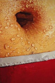
- Fosco was not familiar with the work of Marilyn Minter but he should have been. Minter's art is feminist, sure, but it's also voluptuous and enticing. The SFMOMA is showing "Strut" (2004-05), a painting on enamel of a dirty and sweaty heel in rhinestone-encrusted Dior stilettos. The message is obvious, but it's sooo pretty to look at. See it here. As I was researching Minter, I found another of her works that I adore. It's called "Treasure Trail" (2003) and you can see it below:
 I think this is a remarkably sexy painting, and that response is destabilized (at the same time that it occurs) by questions of the sex of the owner of the navel as well as by questions about objectification and voyeurism. Fosco likes a painting that makes him horny and uncomfortable at the same time.
 - Jenny Holzer has been one of Fosco's favorite artists for years. In fact, he even has one of her "truisms" tattooed on his shoulderblade. (Which one? Discover for yourself and receive a complimentary t-shirt.) On display at SFMOMA was Holzer's "I AM A MAN" (1987), a ten foot tall vertical LED board with red and green messages (in all CAPS and with no punctuation) scrolling rapidly upward. Fosco managed to read
- WHY I FIGHT IS NOT YOUR BUSINESS
- THERE IS PLEASURE IN STOPPING MY FLESH WHEN IT DOES WRONG
- I NEED PERFECTION BUT WHEN I IMPLEMENT IT HALF OF EVERYONE DIES
- WHY I FIGHT IS NOT YOUR BUSINESS
- The last highlight I will mention in this exhibit was a painting by Julie Mehretu, Fosco's homegirl from Michigan (reprazent!). Mehretu has (justifiably) become an art star in the last few years (since Fosco saw her coming-out party at the 2004 Whitney Biennial), even receiving a 2005 MacArthur Foundation Grant (Fosco thinks they're nicknamed "genial grants" because the recipients are typically quite friendly). At any rate, Mehretu's compositions are usually quite stunning. They are composed in ink and acrylic paint, but they fool the eye into perceiving several layers of depth, typically including: grids (or askew grids) in ink, lines of movement/force, and brightly-colored almost-recognizable shapes and symbols. The effect is kinetic, but in an energizing (not tiring) way. The SFMOMA recently acquired "Stadia I" (2004), but, unfortunately, I wasn't able to find an image on the web. You can get the idea, at least, from "Stadia III," a painting from the same series:
 "Stadia I" is a little bit less easily identifiable as a stadium (the flags aren't quite as obvious), but it is essentially similar.
Some representative highlights from several of the other exhibitions (this is turning into a long post and splitting them up doesn't seem worthwhile):
- Charles Sheeler's "Aerial Gyrations" (1953) was really fascinating to me. I wrote a long paper on Sheeler in college and thought I had his "precisionist" style pegged (check out some representative work here), but then this little painting shows up as a nifty surprise. The reproduction here isn't great, so you can't tell that those are pastel colors (not usually associated with Sheeler). And it's so cubist! This isn't the "precisionist" Sheeler. Consequently, this is a really interesting painting and were Fosco an art historian, he would want to spend some time thinking about it. But, as he is only a blogger, he is moving on.

- Creepy architecture from the FUTURE! That's what is designed by Xefirotarch. They do some kind of thing with biological processes that produces shapes that don't exactly occur regularly in geometry. It all looks pretty complicated and math-based to me. Also, as far as I can tell, nothing they have designed has been built. I'm sure that "theoretical architecture" is important and all, but I especially like it when architects build things.
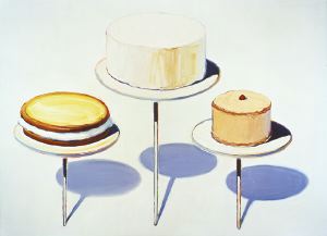
- How can anyone not love Wayne Thiebaud? I love his "Display Cakes" (1963) so much. Thiebaud is brilliant at making food seem otherwordly, comforting yet strange. What planet did these cakes arrive from? And why do they still look so delicious?
 Fosco once spent an incredibly romantic date strolling through the Thiebaud retrospective at the Phillips Collection in DC with a charming young man named Henry. Unfortunately, the object of Fosco's affection later turned out to prefer to date less interesting and less entertaining people... De gustibus non est disputandum. But that date was still bliss, and Fosco has transferred a portion of that affection to Wayne Thiebaud.
 - Graphic designer Rex Ray creates posters for concerts and, as a small exhibit in the SFMOMA's Design Collection suggests, they are beautiful. I love this poster for a Radiohead show:

Aren't you impressed that I made it this far and didn't once mention the most famous work in SFMOMA's contemporary collection? Enjoy...


No comments:
Post a Comment